CSS Fundamentals
Flexbox, Grid, responsive UI 12h
Turn plain HTML into modern, responsive interfaces using the box model, Flexbox, and CSS Grid, all organized around a small design system you can reuse across projects. Instead of copying random snippets, you will learn how to reason about spacing, layout, and typography so you can design clean, consistent pages on your own.
By the end you will be able to:
4 outcomes- Use the box model, margins, padding, borders, and display types to position and space elements on a page without guessing or relying on trial and error.
- Apply Flexbox for common one-dimensional layouts like nav bars, card grids, sidebars, and centered sections that adapt to different content lengths.
- Use CSS Grid to build more complex two-dimensional page layouts such as dashboards, gallery pages, or marketing layouts with distinct rows and columns.
- Build responsive designs that adapt across mobile, tablet, and desktop using a mobile-first mindset and a small, reusable set of breakpoints.
Training highlights
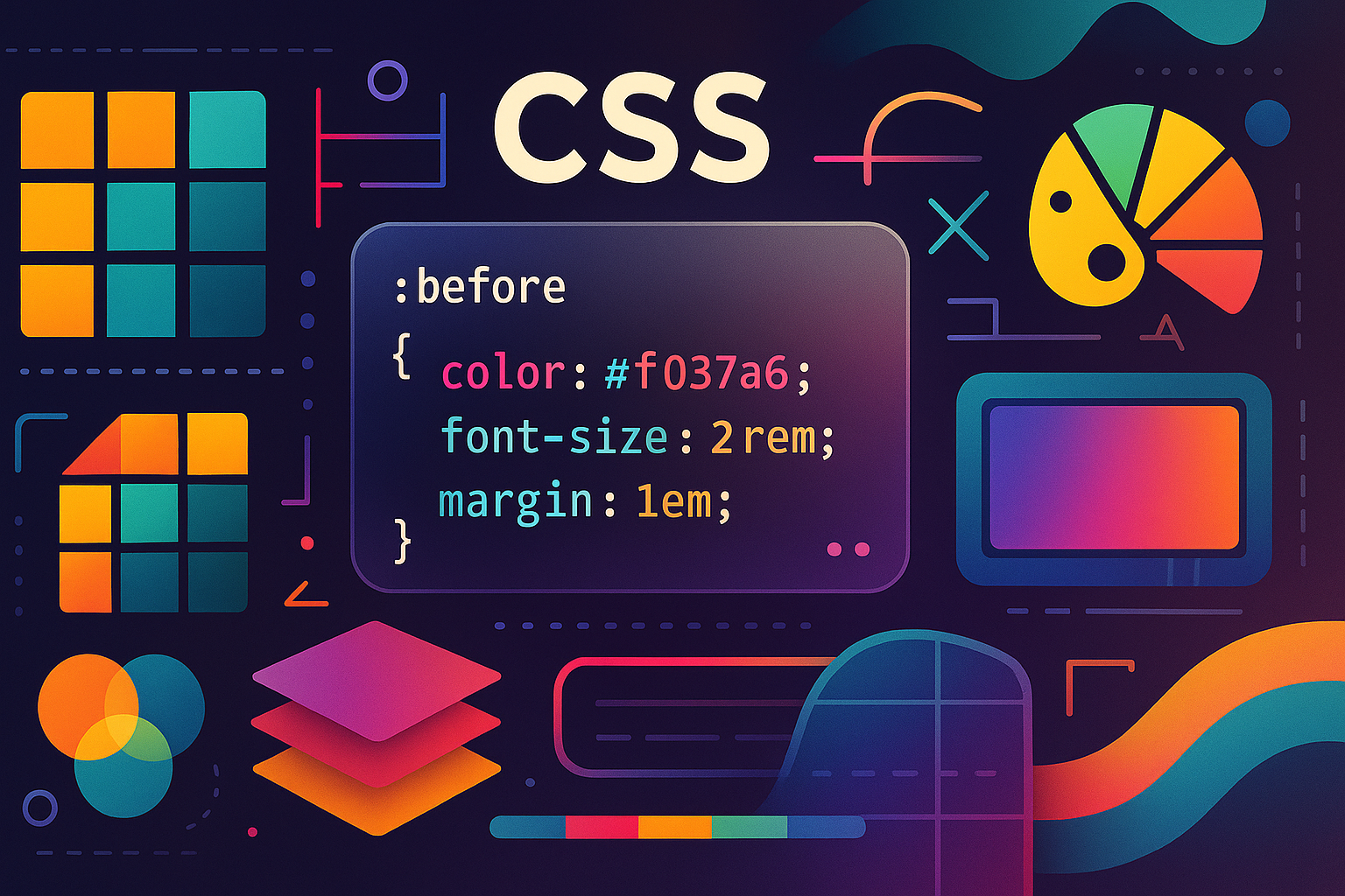
4 key themes- Box model, cascade, and custom properties (CSS variables) used to define a reusable spacing, color, and typography system for your site.
- Practical Flexbox patterns for navbars, feature grids, and content blocks that remain readable when content grows or shrinks.
- CSS Grid layouts for full-page structures and card-heavy sections such as dashboards and portfolio galleries.
- Responsive design with breakpoints that feel natural, not arbitrary, so your site looks intentional at common device sizes.
Syllabus
3 sectionsCSS syntax, selectors, the cascade, and the box model. You will build a simple design system using CSS variables for colors and typography, and create a basic layout that uses margins, padding, and borders to clearly separate sections.
Flexbox in depth (axes, alignment, wrapping) and an introduction to CSS Grid. You will build a responsive nav bar, a card grid, and a two-column layout, then add responsive breakpoints so everything looks clean on phones and desktops.
Design and build a responsive marketing landing page that includes a hero section, feature grid, testimonial area, and call-to-action. The layout should use Flexbox and Grid, adapt at multiple breakpoints, and feel polished enough to show in a portfolio.
Training plan
7 modulesFollow these modules step by step. Each one included concrete tasks so you actually learn and ship something real. You could have treated each module as one focused work session or spread the steps across several days.
Module 1: Connect CSS and Understand the Box Model
- Create styles.css in your project folder and link it from your HTML with <link rel="stylesheet" href="styles.css"> in the <head>. Confirm that a simple body background-color change appears in the browser.
- Apply global font and color rules to body, h1–h3, and p elements, then create a small section that uses different font sizes to visually separate headings and body text.
- Build a simple card component using a <div> with padding, margin, and border. Duplicate the card several times to see how spacing changes affect the overall layout.
- Use your browser’s devtools to inspect the card and turn on the box model view so you can see margin, border, padding, and content areas for several elements.
- Experiment with display: inline, inline-block, and block on different elements and observe how they affect layout and line breaks.
- Add a simple CSS reset or use a minimal normalize pattern to reduce browser inconsistencies before you build more complex layouts.
Module 2: Selectors, Specificity, and Cascade
- Write basic selectors for tags, classes, and IDs, and verify which rules apply to a given element by checking the devtools Styles panel.
- Practice combining selectors (for example, .card h2 or nav a) to target elements more precisely while keeping your CSS readable.
- Intentionally create conflicting rules (for example, two color declarations for the same element) and use devtools to see which rule wins and why.
- Use :hover and :focus pseudo-classes to create basic interactive states for buttons and links, and confirm that focus states are keyboard accessible.
- Introduce CSS variables for key design tokens such as colors, spacing, and font sizes, and refactor repeated values to use these variables.
- Create a short note that summarizes how specificity is calculated and what to avoid (such as overusing !important or deeply nested selectors).
Module 3: Layout with Flexbox
- Wrap your site’s main navigation links in a container and set display: flex on it. Use justify-content and gap to control spacing between items, and align-items to vertically center them.
- Create a 3-card layout using display: flex on the parent, and use flex-basis or flex: 1 to control how wide each card becomes. Experiment with different max-width values so the layout does not stretch too far.
- Practice centering content both vertically and horizontally in a full-screen hero section using flexbox properties. Confirm the hero remains centered at multiple window sizes.
- Add flex-wrap to a container with several cards and verify that on smaller screens the cards wrap into multiple rows instead of shrinking to unreadable sizes.
- Experiment with align-self on a single item to override alignment behavior inside a flex container and see when that might be useful.
- Build a simple pricing section with three plans side by side using Flexbox, and highlight the middle plan by adjusting its flex value and styling.
Module 4: Page Structure with CSS Grid
- Create a layout container using display: grid and grid-template-columns to define two columns (for example, 2fr 1fr). Place main content and a sidebar into these areas.
- Add a header and footer and convert the layout into a more complete grid that uses grid-template-areas. Name areas such as 'header', 'main', 'sidebar', and 'footer', and assign elements to each.
- Experiment with fr units and minmax() to create flexible columns that grow and shrink without collapsing. Test at narrow and wide window sizes to see how columns behave.
- Take an existing multi-section page from your HTML training and re-implement its layout using Grid, keeping the visual hierarchy similar but cleaning up the CSS.
- Use grid-gap (or gap) to control spacing between rows and columns, and compare the result to using margins on individual elements.
- Create a simple gallery layout with equal-width columns on larger screens that collapses to fewer columns as the screen narrows.
Module 5: Responsive Design and Breakpoints
- Choose one or two key breakpoints (for example, 640px and 1024px) and add @media queries to your CSS. Start with a mobile-first layout and layer in changes for wider screens.
- Adjust font sizes, section padding, and line lengths at different screen widths so text remains readable and does not stretch across the entire screen on large monitors.
- Update your Flexbox and Grid layouts so they switch from single-column to multi-column at your chosen breakpoints, and verify that important content remains near the top.
- Use browser device emulators to test your page on several predefined devices, and write down at least three changes you make based on what you see during testing.
- Create responsive utility classes (such as .hide-on-mobile or .show-on-desktop) and use them sparingly to control element visibility at certain sizes.
- Compare a mobile-first approach (base styles for small screens, overrides for larger) to a desktop-first approach, noting the pros and cons of each.
Module 6: Polish, Theming, and Design System Basics
- Define a small design token set in :root using custom properties for primary, secondary, and accent colors, along with base font sizes and spacing units.
- Refactor your existing CSS to reference these tokens instead of hard-coded values, reducing the number of unique colors and spacing sizes in your stylesheet.
- Create variants of key components (such as buttons and cards) for primary, secondary, and subtle use cases, making sure they all feel like part of the same family.
- Experiment with a dark-mode theme by overriding your CSS variables inside a prefers-color-scheme media query and verifying that your layout still looks good.
- Audit your page for visual clutter: look for misaligned edges, inconsistent margins, and typos in font sizes. Fix small issues until the page feels calm and intentional.
- Document your design tokens and component rules in a simple 'style guide' page inside the same project so you can reuse them on future sites.
Practice & Assessment: Portfolio-Ready Landing Page
- Design a one-page product or course landing page using your own color palette and typography choices defined as CSS variables. Sketch the layout on paper before coding.
- Implement a mobile-first layout that starts as a single column, then expands into two or three columns at wider breakpoints. Confirm that no content overlaps or becomes unreadable.
- Validate the layout by testing it on at least three screen sizes (small phone, tablet, desktop). Take screenshots and compare the visual hierarchy across sizes.
- Refine spacing, font sizes, and alignment until the page feels like a polished marketing page you would feel comfortable sharing with others.
- Ask someone who is not a designer to scroll through your page and tell you what the product is, who it is for, and what they should do next. Adjust the layout to make those answers clearer.
- Create a brief checklist you can reuse for future projects covering colors, typography, spacing, breakpoints, and component consistency.